TROUBLING
INTERFACES
INTERFACES
'Troubling Interfaces' is a workshop designed by Ksenia Kopalova, Naomi van Dijck, and Asha Ward. It invited the BA and MA Illustration and Animation students from the Kingston School of Art, as well as technicians and academics from the Arts University Bournemouth to spend 30 minutes to remix a screenshot of the interface of Amazon marketplace - to see what this process can tell about interfaces, their invisible presence, Amazon, and illustration.
Cover: Jiaye Zhao

Interfaces, even though often made to be perceived as 'intuitively accessible' and barely noticeable, are not neutral, and push towards very particular behaviours, whilst preventing the unwanted responses.
Echoing the texts by Alexander Galloway and Lev Manovich, the workshop presents interfaces as ‘mirrors’, reflective surfaces that expose the environments it touches - with their biases and ideologies, - but largely stays unseen itself.
How can illustration as a practice and as a discipline respond, question, and conceptualise the presence of the interface?

[My remix is about] the excessive forced pop-ups. Whenever I try to open a webpage or a shopping app, many mandatory pop-ups always appear. I've also noticed that the 'X' to close these pop-ups comes in various forms, such as 'Close' or 'Cancel.' The sizes of these buttons also vary, and if I press the wrong one, it might redirect me to other pages or apps.
ANNI ZHU:

Digital drawing:
Online stores push to certain behaviours so more purchases are made through marketing and promoting things we may not need. What if the interface was completely stripped down to just a search bar? No images, no categories that push to mindless scrolling and purchasing of the unwanted, no marketing. Just a bar that leads you to the thing you wanted in the first place. Could this be less overwhelming? Would it lead to small businesses benefiting from this to be in danger? Would it be more sustainable since less products consumed would mean less production from large companies?
Physical remix:
I covered anything that was promoting offers or specific products. I simplified everything and made them into icons so that it becomes informative instead of promotional. I also covered anything that entices the user to stay on the website or dive deeper like: discover more or shop now.


Whilst researching for sustenance, I came across this Amazon interface. Unfortunately, it did not work for my survival needs.
No provision was available, even exploring the immense amount of available products was fruitless.
My response was to resort to the DIY approach and create some escaping noodle pasta(?). Yum Yum.
Unfortunately this is not particularly functional, it will still not meet my need of nutrients and it does not work as a commercial platform either.
This interface is now very useless, however it does have a smile on it, to cover up the uselessness with happiness.
LUCIA PAGANINI:

[I was] folding the physical paper interface so that it’s modified to only show the products that the user is interested in. In this case, I chose tech-related objects to tailor to the needs of a younger audience, as well as a parent looking for a gift for their child. The only way to see the rest of the products - if interested - is to fully open up the entire catalogue.
ASIA DE ROSA:

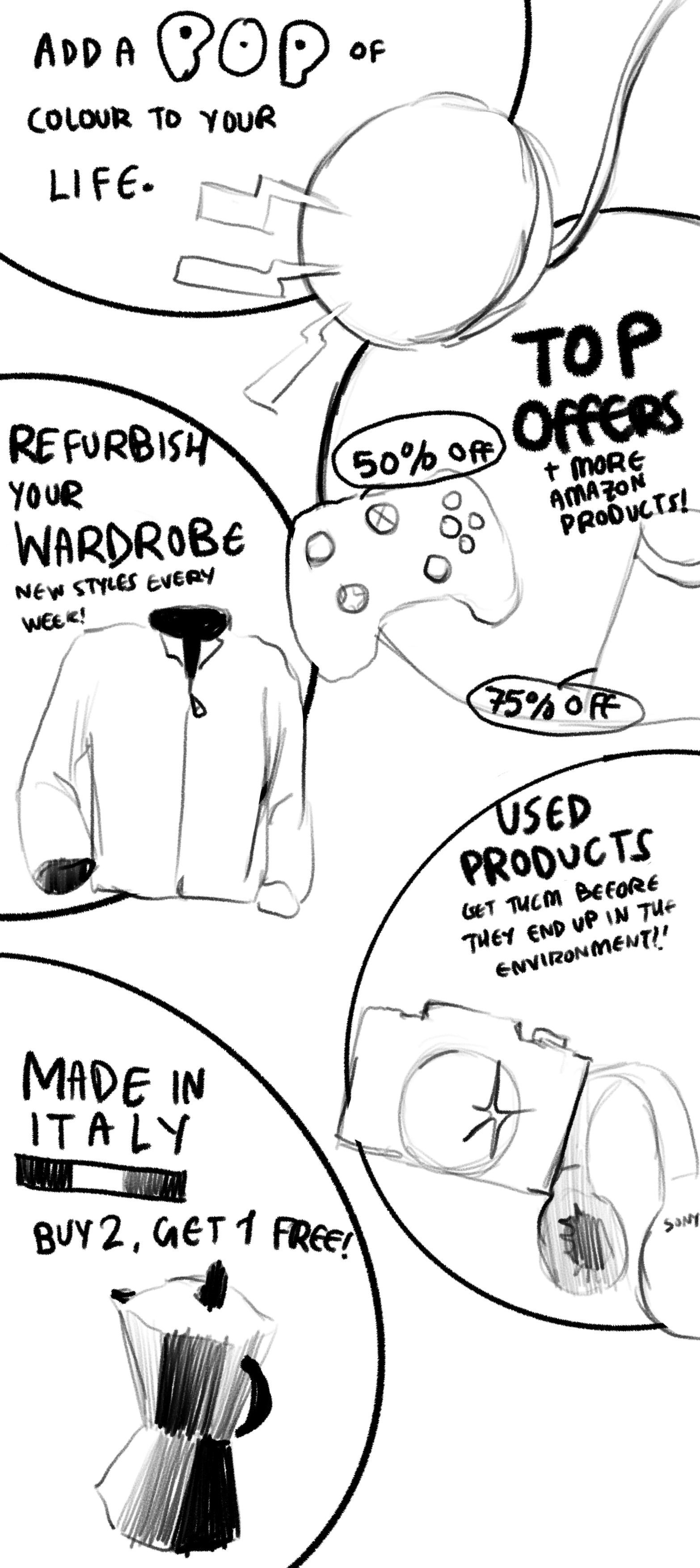
Using Procreate, I redrew and simplified the original interface, so that it wouldn't overwhelm the user upon opening the website. I picked up recurring themes and included them as one of the major categories- 'refurbishing' and 'Italian products' being one of them. This interface was created with the intention of still attracting visitors while also making the shopping experience just as fun but more relaxed, with products of interest popping out (literally) and unnecessary ones being within the categories visible on the screen.
It will remain fairly static as visitors scroll down with minimal animation to still draw attention to specific products.
It will remain fairly static as visitors scroll down with minimal animation to still draw attention to specific products.
ASIA DE ROSA:

I find the arrangement of modules and shape selection on this page very interesting, so I simplified the outline of the product modules in this interface, extracted the patterns of the products and background colors, and created a geometric pattern.
Therefore throughout the creative process, I paid more attention to the background of the page rather than the products themselves. I think this is a completely opposite way of viewing the page. Also, I transformed a highly informative page into a graphic image.
Therefore throughout the creative process, I paid more attention to the background of the page rather than the products themselves. I think this is a completely opposite way of viewing the page. Also, I transformed a highly informative page into a graphic image.
SHOUYIYUAN FENG:

I snapped the site's red discounts and words like "best of" and made them into a flashing animation. I must admit that I'm one of those people who, when I see a sale on an item and feel the slightest urge to buy it, I convince myself that I might need it. And this is exactly the strategy of the merchants to attract us to spend money. At the same time the abundance of items in the shopping interface creates an illusion: it seems as if we could have the chance to have it all.

Consumption flying chess
('Flying chess' is a fast-paced Chinese board game where players move airplanes to the center of the board - ed.)
('Flying chess' is a fast-paced Chinese board game where players move airplanes to the center of the board - ed.)

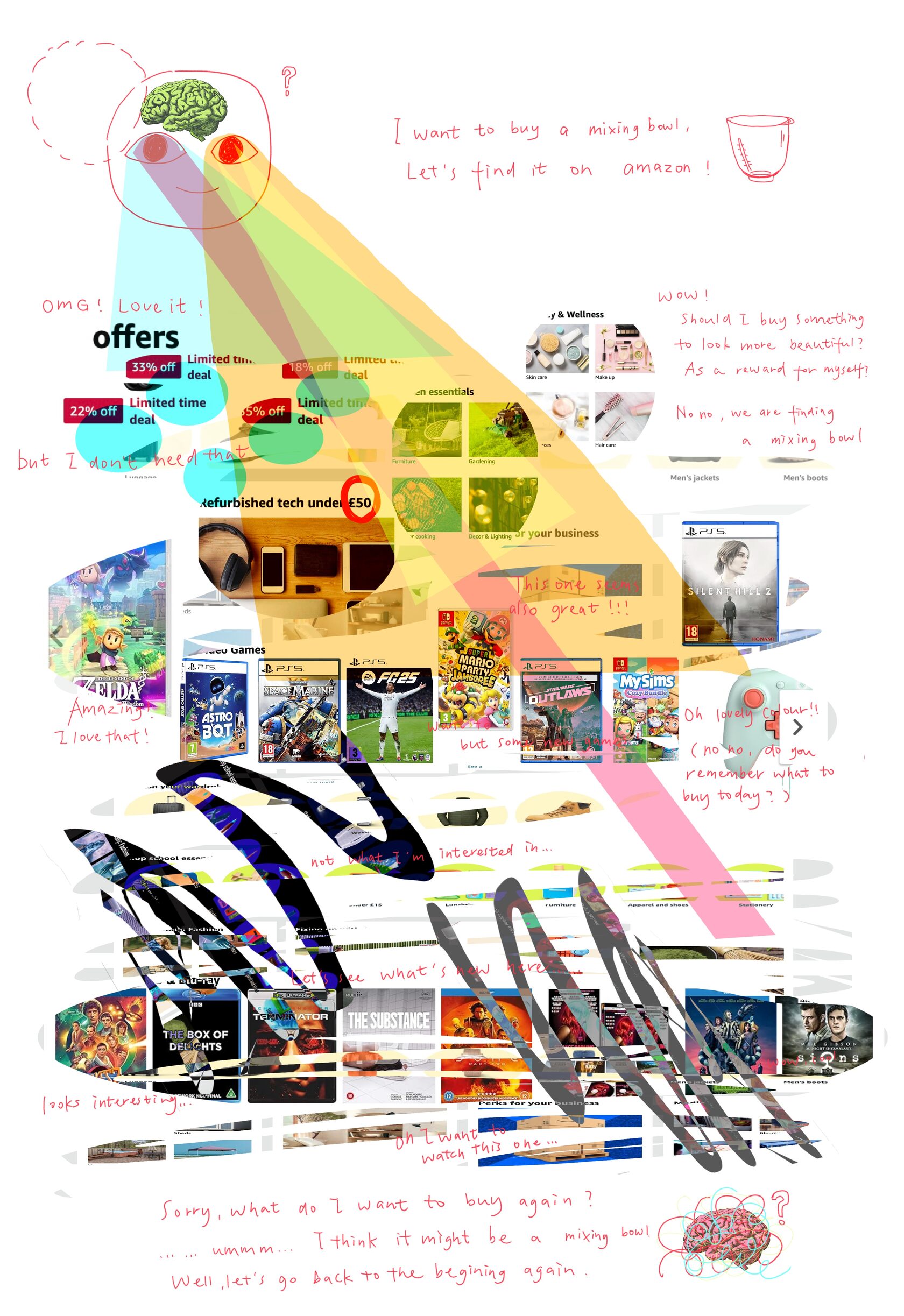
I try to visualise my eye path of using amazon to buy something. I use some shape to select the certain information which caught my attention and their sequence. Then I add a character and some text to connect this shapes as whole process.
Every time I shop online, I always do not only buy the thing I want at first, I always buy more things. Like last time, I want to buy a big bowl and then I found mixing bowl on amazon, then a pair of
silicone spatula, a big water bottle. That's "magic".
The display and guidance of the website immerse people in the information shock. To me, this kind of shock make my mind tired. And my work could visualise this kind of feeling.
ROMY WANG:

Everything adds up perfectly to this bright and appealing picture which seemed to be quite well organised in the beginning, but ends up being very chaotic when you start looking at it. Saturated colours setting up the mood (looking for something screaming ‘money’? we have some rich looking beige for you! looking for something fun? we have a lot of bright orange), whole bunch of objects that suit everyone’s taste - huge mess, so overwhelming I almost forget what I actually need and start thinking Amazon will tell me what I need. I focused on this feeling of being overstimulated by the amount of objects on this page and pictured this feeling.
SOFIE ZELENINA:

We 'lifted the flaps' on the amazon interface by unveiling the truth(s) behind the categories of consumerism to reveal the true costs of our relationships with products. We explored what they think we want and the narratives around - recommendations/you might like/if you liked this you might like that/see more/refresh - mixing up the curated breadcrumb trail and layering this over documented journalistic investigations. We wanted to unmask the glossiness to reveal the hidden truths of everyday to see who really pays and how. We aimed to contextual the interface in order to disrupt the consumer and their convenient consumption process which is well streamlined usually and offer our own narratives supported by mass-media articles.
ASHA AND EDWARD WARD:
Special thanks to Stephanie Black for the invitation to the Kingston School of Art and the generous support in organising and conducting the workshop.
